October 8, 2018Comments are off for this post.

Paul Rand, the man with the brand

Paul Rand was a pioneer when it came to capturing an entire business in one simple, elegant symbol

One of the major draws at this year’s Offset creative conference, which took place in March, was Paula Scher from design powerhouse Pentagram.

During her highly entertaining delivery, she gave attendees a brief glimpse at one of her projects, and one of the most high-profile design jobs in the business – the new logo for Microsoft Windows 8, which no doubt has been battering your eyes from all manner of advertising hoardings and formats in recent weeks.

According to Pentagram, the “logo re-imagines the familiar four-colour symbol as a modern geometric shape that introduces a new perspective on the Microsoft brand”.

At the time, Scher was more succinct. After giving a blink and you’d have missed it look at the already-familiar four-pane logo, she said: “I know what you’re thinking. You don’t like it. But you will.”

This confidence speaks volumes about her prodigious graphic-design ability, and on the Windows front at least, she’s right. This ability to encapsulate a company in a single, relatively simple symbol seems almost utterly innate. And perhaps the best person in this business was American graphic designer Paul Rand.

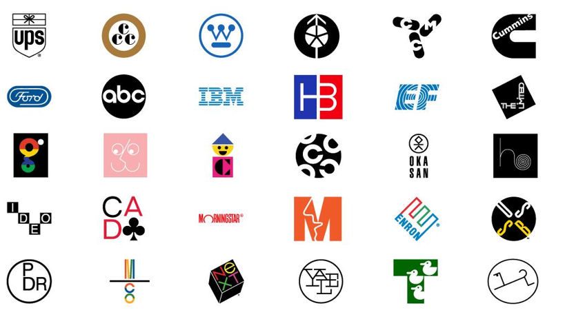
Rand is responsible for a series of corporate symbols that pop into your head almost unbidden. His clients have included IBM, Enron, UPS, ABC, and NeXT, the company founded by Steve Jobs when he quit Apple in 1985. Jobs, perhaps one of the most exacting clients a designer could have, was unstinting in his praise, calling Rand “the greatest living graphic designer”.

Perhaps the strongest testament to Rand’s work is the fact that many of his designs survive, some decades after their creation, albeit with some minor modifications and evolutions to their look and feel (Rand died in 1996).

Paul Rand was educated at the Pratt Institute, the Parsons School of Design, and the Art Students League, although he regarded himself as largely self-taught, having begun his foray into commercial design by painting signs for his father’s grocery shop and for school events.

No part of his life went uncritiqued – he was born Peretz Rosenbaum, but pared even this back, figuring that “four letters here, four letters there, would create a nice symbol”.

He was one of the originators of the Swiss style of graphic design, but more than anything he created graphic design as an industry. In the words of fellow graphic designer Louis Danziger: “He almost single-handedly convinced business that design was an effective tool . . . He more than anyone else made the profession reputable. We went from being commercial artists to being graphic designers largely on his merits.”

Rand may have had a genius for industrial design married with a gift for salesmanship, but he was much more than a company man. He revered modernism, as is evident by his spare, clean logos, and in later life earned the ire of younger colleagues by railing against postmodernist theory and its influence on design. In A Designer’s Art, Rand said, “Ideas do not need to be esoteric to be original or exciting.” Another of his books, Thoughts on Design, remains a core text for graphic designers.

His logos could not live in a limbo. His American Broadcasting Company trademark, which he made in 1962, is a beautiful exercise in restraint, and he insisted that it was its association and what it represented that gave it meaning, rather than the symbol in and of itself: “It derives its meaning and usefulness from the quality of that which it symbolises. If a company is second rate, the logo will eventually be perceived as second rate. It is foolhardy to believe that a logo will do its job immediately, before an audience has been properly conditioned.”

Much of his work was built around the precept that a logo “cannot survive unless it is designed with the utmost simplicity and restraint”, something elegantly illustrated by the current exhibition of his work at the Ebow gallery at 1 Castle Street, Dublin 2. The show is part of Design Week 2012, and features around 30 original pieces by Paul Rand, an animation of some of his work by New York studio Imaginary Forces, and specially commissioned prints from Irish artists Johnny Kelly and James Earley.

Source: The Irish Times

January 5, 2017Comments are off for this post.

Creative & Strategic

Everyone wants to be taken seriously, valued for their contributions, and have a real voice for how to best solve problems or achieve business goals. However, gaining this type of respect has proved difficult for in-house creative services teams. In fact, nearly 45 percent of in-house creative teams report that gaining respect from internal clients is one of their greatest challenges.

It’s all about perception. The internal clients of in-house creative teams often tend to view them as merely, “service providers,” rather than strategic partners, based on several incorrect perceptions that in-house teams lack the talent and skills that an external agency can provide. This perception is one of the largest roadblocks creative professionals face in altering client attitudes and gaining respect. As Bob Calvano, director of Merck’s Global Creative Studios notes, “A lot of the juicy, high-profile projects go out to agencies because folks think that the agencies have better talent.…In many cases, the in-house team is the best agency for the project, but a huge shift needs to take place in order for this to happen.”

This white paper offers the following six tips creative teams can use to position themselves as valued, strategic partners and receive more respect from the rest of the company:

  • 1 Act like an agency
  • 2 Use numbers and data to prove your worth
  • 3 Guarantee on-time delivery
  • 4 Be strategic about how you manage your work
  • 5 Establish the creative team as your company’s brand authority
  • 6 Focus on improving the client experience


Full PDF from workfront

May 12, 2016Comments are off for this post.

Why A Brand Matters

Band-Aid1

In one sense, perhaps the most important sense, a brand is a promise. Think of some top brands and you immediately know what they promise: McDonald’s, Coca Cola, Budweiser, Ford, Apple AAPL -2.49%, MetLife MET -0.21%.

You know what you’re going to get with a well-branded product or service.

In another sense, a brand is a specific combination of logo, words, type font, design, colors, personality, price, service, etc.

It’s also a bundle of attributes. Think of Volvo, for instance, and your first thoughts are probably going to be something like “well built, comfortable, Swedish” and, most of all, “safety.”

The promise, look, personality and attributes can eventually acquire a special patina of what I call “me” appeal. Buying a certain brand says something about the person who buys it. Apple has that patina. So does Prius. The booze and clothing businesses are filled with patina products: Cristal, Guinness, Ralph Lauren, Manolo Blahnik.

All of this can lead to sub-brands, like iPhone and iPad which acquire the aura of the parent brand.

It takes a lot of time, money and very hard work to build and maintain great brands like that, brands that can speak volumes in just a few syllables.

Source: Forbes

January 21, 2016Comments are off for this post.

Simple, Creative, Direct

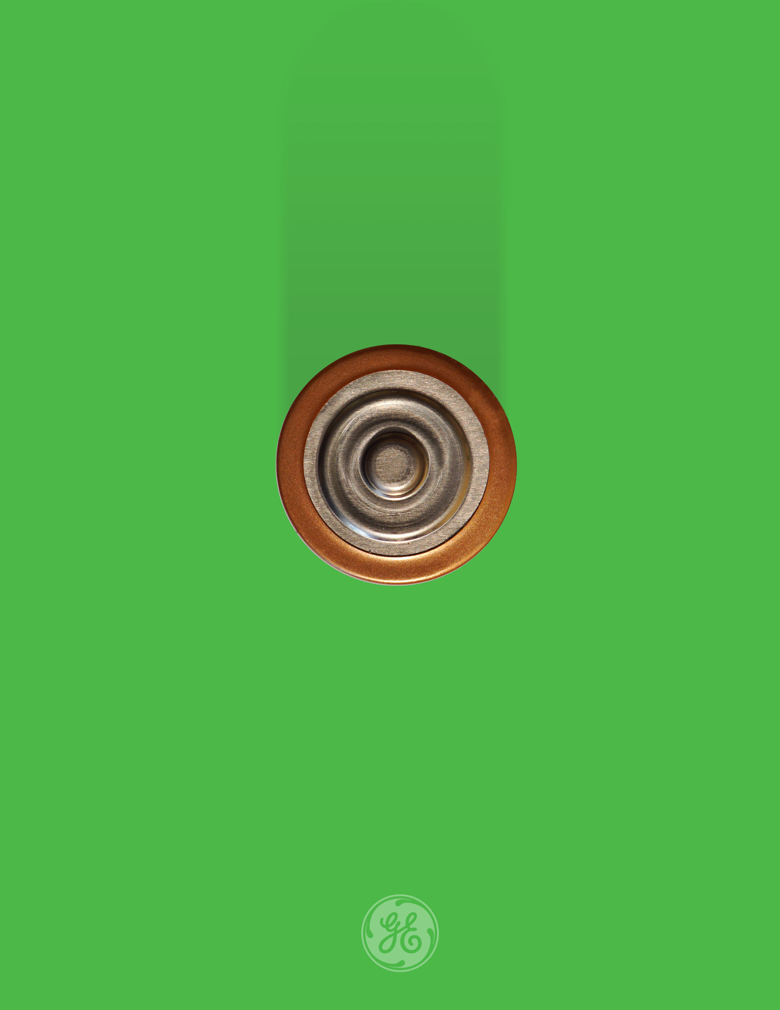
Battery_GE_2

Less is More!

Leonardo da Vinci once said: “Simplicity is the ultimate sophistication”, and architect Ludwig Mies van der Rohe adopted the motto “Less is more” to describe his extreme simplicity, by enlisting every element and detail to serve multiple visual and functional purposes (such as designing a floor to also serve as the radiator, or a massive fireplace to also house the bathroom).

Even after 500 years Leonardo’s words are true and this rule is still widely used in design and advertising. It may sound  a bit contradictory, but simple things often require much more brain power to create than the most complicated stuff. And it always strikes you when something completely simple is capable of conveying so much more than you expect.

Without further ado, let’s take a look at 26 most creative examples of minimalist advertising, and afterwards you can always leave a comment telling how much you liked our post!

Source: BoredPanda

January 21, 2016Comments are off for this post.

Are you being creative?

Vodka-Surrealism

Creativity is one of the most commonly used terms in marketing communication as those who develop marketing communication messages are often referred to as “creative types” and agencies develop reputations for their creativity. So much attention is focused on the concept of creativity because the major challenge given to those who develop marketing communication messages is to be creative. Creativity has been defined as “a quality possessed by persons that enables them to generate novel approaches in situations, generally reflected in new and improved solutions to problems.”